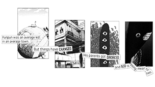
Parallax
The project brief was: To animate a scene with depth. Animation Subject matter is up to you. Output format is up to you.
This project was very open so to give it some purpose I decided it would be a promotional video. I started researching comic book animations and noticed they all seemed similar. Usually action scenes with superheroes. To do something different I picked a Japanese manga that falls under the drama genre.
Process
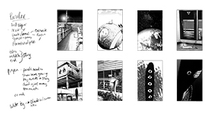
As part of the research I read the whole series while taking note of panels that would work well for parallax animation and tell the over all story without giving too much away.

I started to storyboard how each panel was going to appear, thinking I could have 8 panels fit on screen with parallax happening and text telling the story. Once I moved to After Effects and saw what was going on I knew I needed to rethink it all. I was trying to add too much all at once and it was just a cluttered mess.
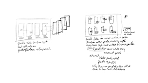
After refining the assets and rethinking how the animation was going to flow; I got a more minimal animation with more impact that stayed true to the flow of the story.
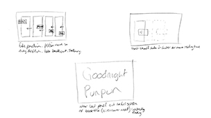
I knew music would play an important role in this project. I needed something that represented the main characters lonely struggle. I had a few songs lined up, one being Closer by Nine Inch Nails because of the way he sings “Help me”. I ended up using the end of the song for it's weaker distressed sound, perfectly portraying the character.
